This special article was authored by by TMOB’s artist: goldstarknight
Can I be real with you? I have never properly developed an art style. A quick skim of my portfolio discloses that I like to experiment with a variety of techniques. And most of what I do is somewhere between imitation and iteration. I would not call myself especially innovative. I’m not saying this as part of a self-deprecating bit. On the contrary: I think having a good eye for what makes a style work and a knack for imitation is one of my best assets as an artist. But never have I sat down, rolled up my sleeves and said to myself: “This time I’m going to do my own thing!” So developing a style for TMOB was going to be a bit of a challenge. Surely not impossible, but also not entirely within my comfort zone.
Getting Started
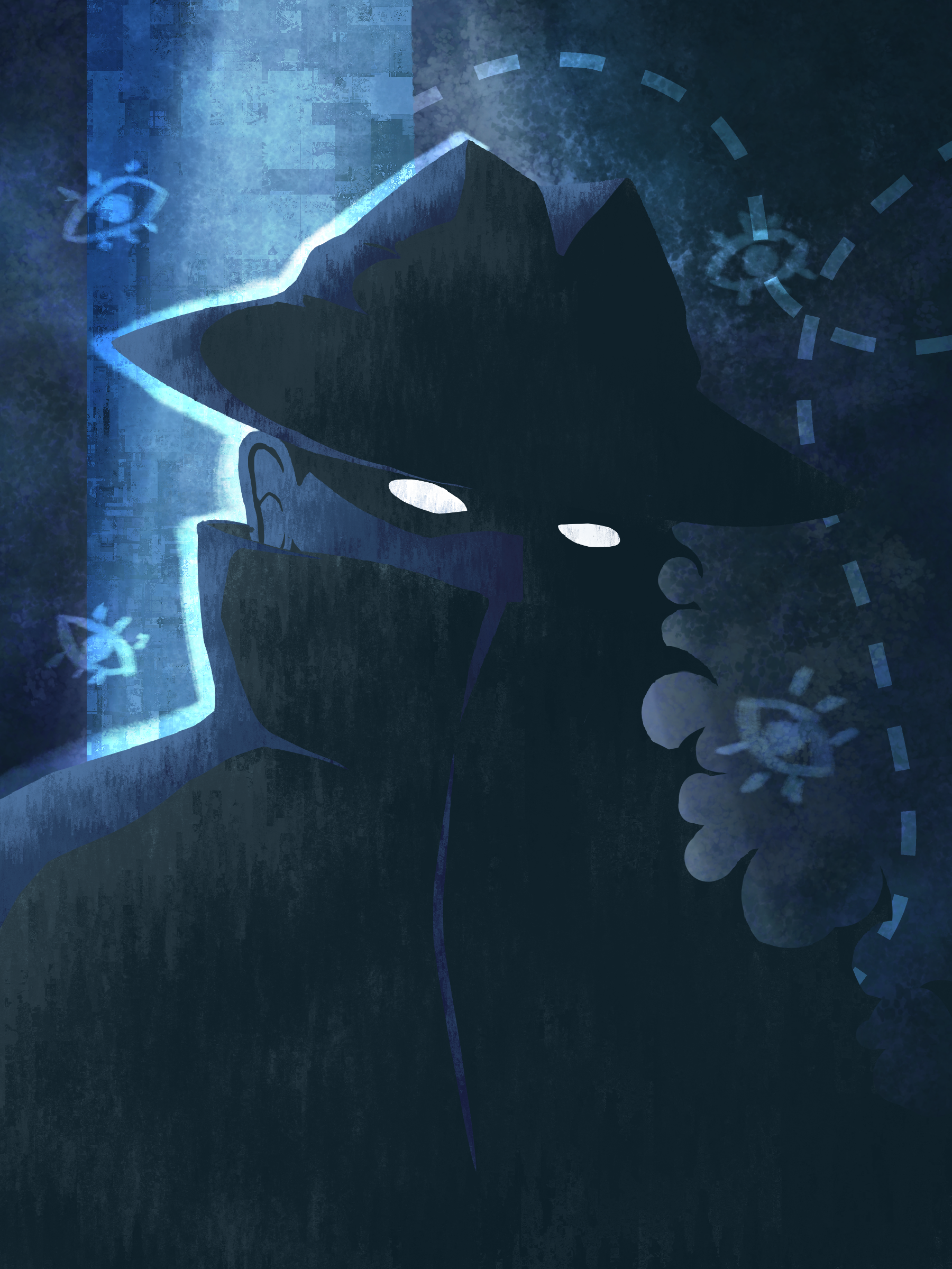
When I joined the project, Blunt had already done some work on the UI and set a general mood for the game. Blobs of ink and energetic brushstrokes as UI elements, a spooky altar in the woods with an ethereal projection of a map and the minimalist relationship web evoked an esoteric mystique, not dissimilar to that of Cultist Simulator, but more wild and nebulous.
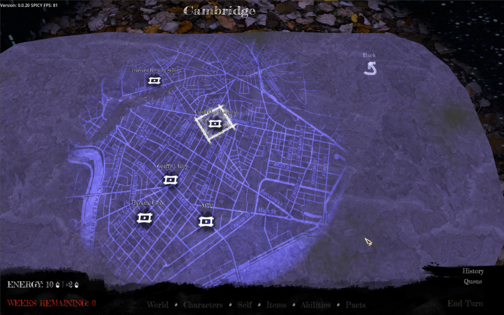
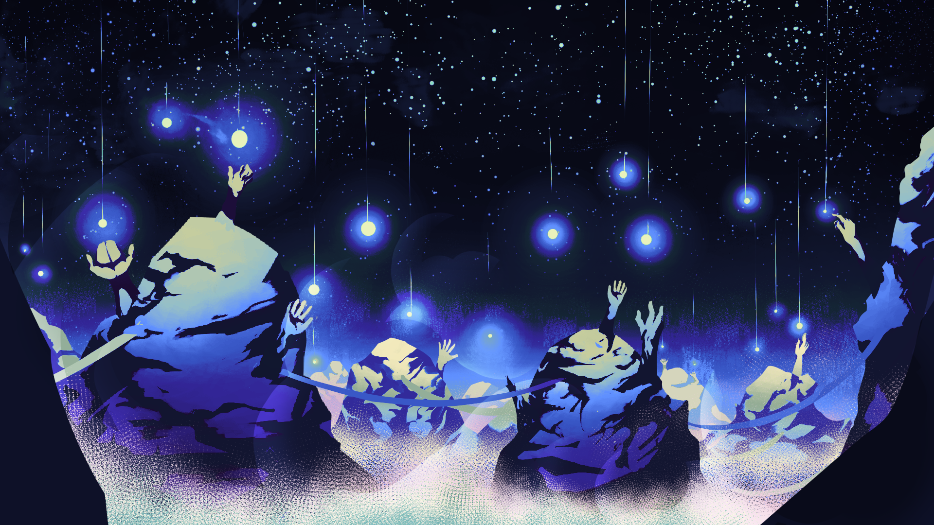
One of the first things I figured out for TMOB was its gameboard. If Cultist Simulator was played on a table, I figured its counterpoint was an altar in the Wood. Since you play a spirit who’s bucked the laws of the Mansus, I specifically wanted to evoke the Temple of the Wheel. The Temple is portrayed as something much bigger than this rock, but what’s scale in the Mansus, anyway? —Blunt
This was a great first step. I had an idea where Blunt wanted the visuals to go, so I set out and searched my reference repository and the internet for different styles which could serve as inspirations. My main task was to figure out how to do the characters and locations in a way that would not only fit the UI we had, but would also be sustainable in the long term and could be produced at a reasonable pace. Additionally they should not be too far off from the style of Cultist Simulator, since we would use that style for the items and having a visual connection to the Secret Histories was important to us.
After gathering some material we hopped on a call to discuss the details. Sifting through the dozens of images, we threw out those we disliked as stylistic guideposts while organizing the rest into what I dubbed a “mood matrix” – a mix between a moodboard and a style guide with two axes: “representative/abstraction” and “concreteness/ephemerality”. Not strictly artistic terminology, but good enough for us to communicate meaning. This is what we ended up with:
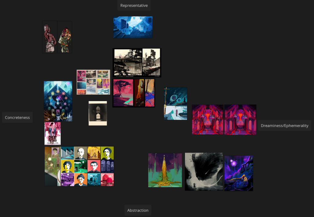
The edges of the graph represent the boundaries of what we wanted, although we would skew toward the right with landscapes and toward the left with character portraits. Similarly, Mansus-aligned imagery would skew downwards while the waking world would skew upwards. I still use this grid as a reference whenever I’m unsure about a specific decision or direction for an image.
Locations: An impersonal sense of place
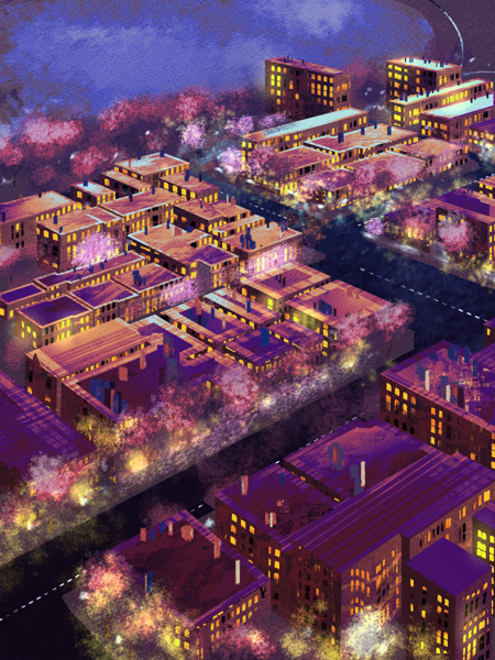
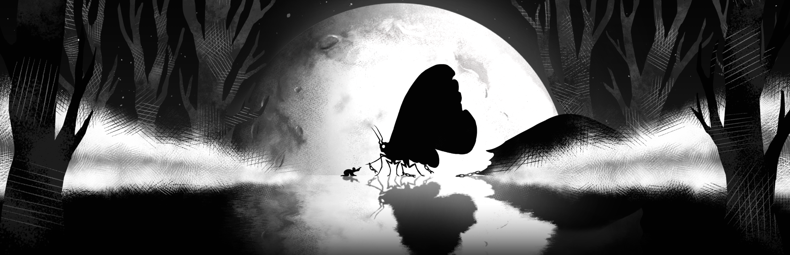
For the landscapes we quickly settled on a style heavily inspired by the two pieces which you can see in the center of our graph (done by the illustrious Eyecager). The strong silhouettes and contrast as well as the simple, yet evocative texturework give the imagination just enough room to speculate about further details. There is a sense of place here, but the lack of detail makes it feel impersonal, toeing the line between depicting a specific location and an abstract representation of it. Plus, this style felt in line with the location images in Cultist Simulator. We popped it into the game to test the look and lo and behold:
Yup, this is it. Naturally it wouldn’t do to just copy that style wholesale. Among the changes I made both subconsciously and intentionally are the use of stronger textures, especially for the non-Mansus locations, and a slightly increased amount of detail. Just enough to make it more interesting to look at at a larger resolution.
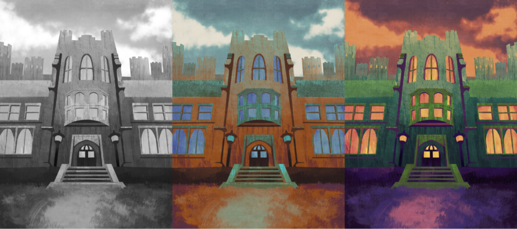
One decision I made early on was to do all the landscapes in grayscale and then colour them via gradient maps.This allows us to quickly try different colourscapes and change the mood of a scene without having to redraw the entire piece. This is not my usual approach, but it seemed very economical, so I gave it a shot and I’m very glad I did
.
Portraits: Windows to the Soul
Cultist Simulator and Book of Hours use a very elegant, minimalistic style to great success, but they are also distinctly different games from TMOB. The art in Cultist Simulator is designed to read well at a distance, so you can easily identify specific cards on a cluttered table. Their convenient colour-coding is often connected to their function and the level of detail is on the lower side. This lead to an issue for us. The average Cultist Simulator run looks like this …

… whereas TMOB would look like this, if we used the same style.
You can see what I’m getting at, right? Although the image is magnified, there isn’t “more to look at” as it were. And the juxtaposition with the more detailed location art makes the character feel flat by comparison. I always thought that the visual style of Cultist Simulator’s character portraits is representative of how the player character isn’t really all that interested in the people they encounter, seeing them primarily as resources like any other card. Empty eyes, neutral poses – there is some alienation going on here, which makes it easier to view characters as “just” a resource to be spent.
In TMOB however, we want you to get up close and personal. You are getting intimately involved with everyone’s personal affairs. You learn what makes them tick and are trying to build trust. Even if you choose to be a malevolent and manipulative spirit, we don’t want you to be entirely disengaged from them and the character art plays a vital role in that.
That being said, we still liked the idea of doing something that was abstract and identifiably Secret Histories related. The colour-coding according to aspects was something we especially enjoyed. Thus, the goal was to find our own take on the style.
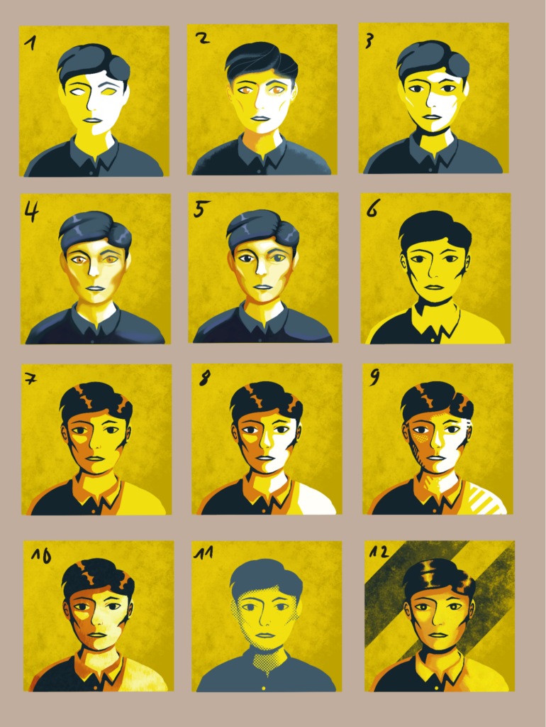
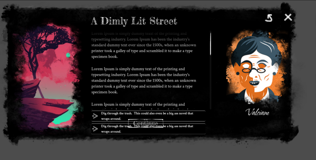
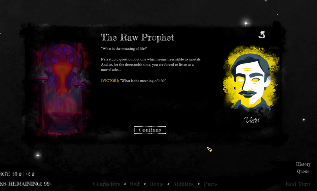
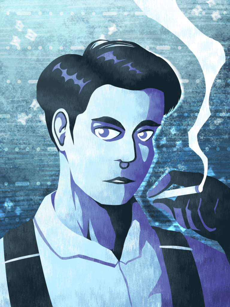
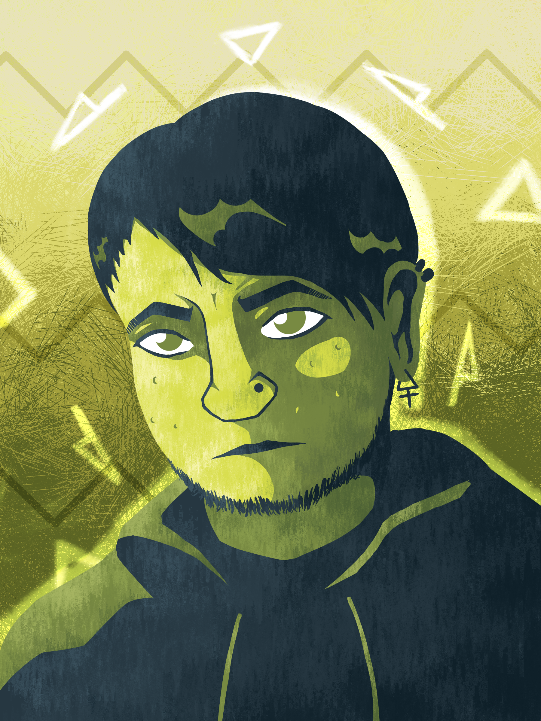
I took Victor, the first character you meet in the game, as the subject, drew him in the CS style and then iterated from there. As I went, I added detail, texture and other stylistic variations, while keeping the colours mostly the same to preserve aspect relation as well as not to distract from the other changes. Two things soon became clear. First, adding at least one more colour allowed for a greater amount of detail and second, the more cel-shaded styles meshed better with the style we had in mind for the landscape art. It also came more naturally to me than the painterly variations. After discussing this with Blunt, we did another round with a focus on three candidates: 2, 10 and 12. Although I was (and still am) a big fan of 9, it didn’t make the cut. I have to admit that it wasn’t the right fit for the project.
Blunt asked me to add a reflection in the eyes and colour in the irises to evoke a greater sense of liveliness and counteract the aforementioned feeling of alienation. Eyes are the window to the soul after all.

I was prepared to do some more iterating after this, but Blunt gave me the go-ahead to try my hand at a full portrait after we decided that B was our top candidate. I remember him being very fond of A as well, but in my opinion the large, untextured shapes didn’t mesh right with the size the images were going to be displayed at.
The only changes for the final portrait were some background adornments as well as a few details on the character design. Our Lantern-nerd just had to have huge dorky glasses.
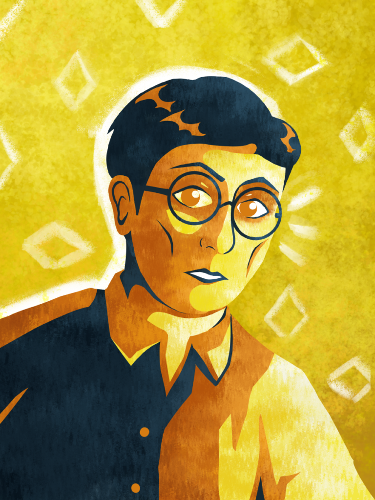
And here we are. That’s how we arrived at the artstyle(s) for TMOB.
Iteration and Evolution
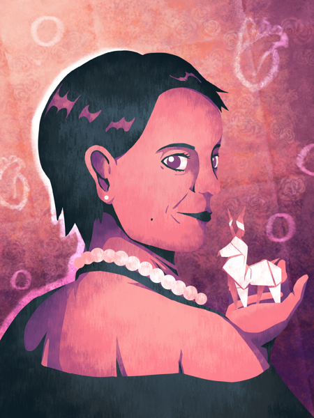
Except … we’re not quite there yet. While I am very happy with Victor’s portrait, it could use some extra zest. As I got more comfortable with the style, I once again started experimenting. Different background textures, more daring poses to convey personality and even some props here and there. Just compare Victor to his buddy Gale.
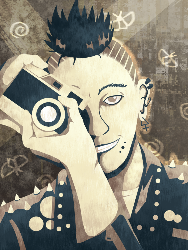
Now that’s personality. Victor is looking a bit bland by comparison, isn’t he? (Don’t tell him I said that. He’s very self-conscious.)
An art style is a tool. Becoming versed with all its uses and exploring its potential takes time. Ideally I would have practiced a lot more first, but the world keeps moving and the work has to get done. Thus, me getting bolder will be a noticeable feature of the project. The style will evolve and you might see me try some truly weird stuff when the opportunity presents itself. I’m confident that my best work is yet to come and I hope you stick around to see it.
[Blunt’s Note: Goldstar gives me credit for the “brush stroke” UI early in the article, but the truth is I was inspired by a “Disco Elysium x Cultist Simulator” UI exercise he posted. This is how we got in touch in the first place! I figured if I was going to steal his ideas, I would see if he wanted to be part of the project. Thank God he said ‘yes’! I’ve also appended a gallery featuring more art from TMOB, mostly because I can’t stop looking at it.]