This Article is presented by Goldstarknight, the artist behind The Matter of Being. Discover his work on Carrd.
The characters are the stars of any visual novel. But how do you create a star that sticks? There’s the writing, obviously, but there’s also the art that accompanies them. A character’s design gives you an immediate first impression and will follow you throughout their story. How do you create a compelling design that deftly interweaves a compelling tale with visual intrigue? That’s a topic that demands a lot more than one article, but I can tell you how we went about it in our occult narrative-strategy game, The Matter of Being! Today I’ll let you in on our character design process, covering how we go from a vague ideas to a fully realized character portraits.
You Only Get One First Impression
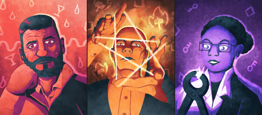
A good TMOB portrait answers the question “Who is this?” on multiple levels. What do they look like? How do they present to others? What are they focused on? Or more succinctly: What’s their deal? A good portrait gets across the essential ‘vibe’ of a character, telling the player what to expect when interacting with them while hinting at their story. And since each character only gets one portrait, we need to make it count.
For instance, Mohammed wears a friendly smile and looks at you directly. He is happy to interact with you as an equal, while Antonius stares you down from above with a dour glare. And Dr. Freeman, absorbed in her research, doesn’t even spare you a glance. We could have just made all the portraits very neutral to avoid this added meaning, but that would rob us of an opportunity to do visual storytelling and since each storyline only has a limited budget of words, we want to inject as much action as we can.
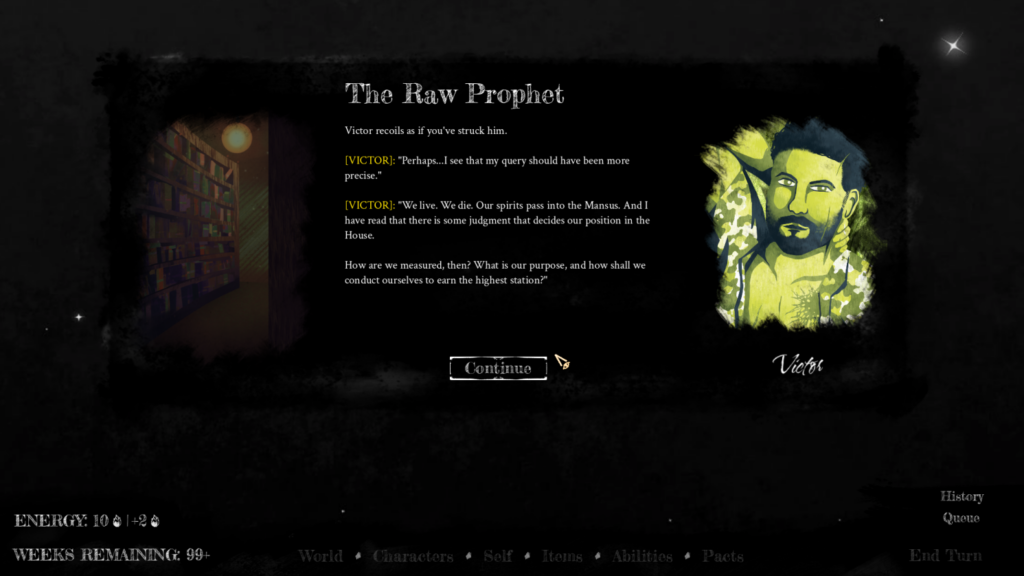
The portrait also recontextualizes the writing in the game itself, especially since we’re using play-style dialogue which makes it a little harder to change the mood of the words that are spoken. A good portrait not only helps you put a face to the name, it also tints your interactions with the character.
The Humans: From Archetypes to Characters
There are two kinds of broad categories for TMOB characters: humans and spirits. As I laid out in my first article, the artstyle is our adaptation of the style established in Cultist Simulator and Book of Hours with changes that cater to TMOB’s specific needs.
Our general process for character design looks like this: first, Blunt will come up with a more or less defined character concept and then we chat about how that character might look and how their life would have influenced their appearance. Sometimes they already have a pretty clear idea of how they imagine them and sometimes they let me venture forth and explore concepts on my own. A good example of the latter case is Viv.
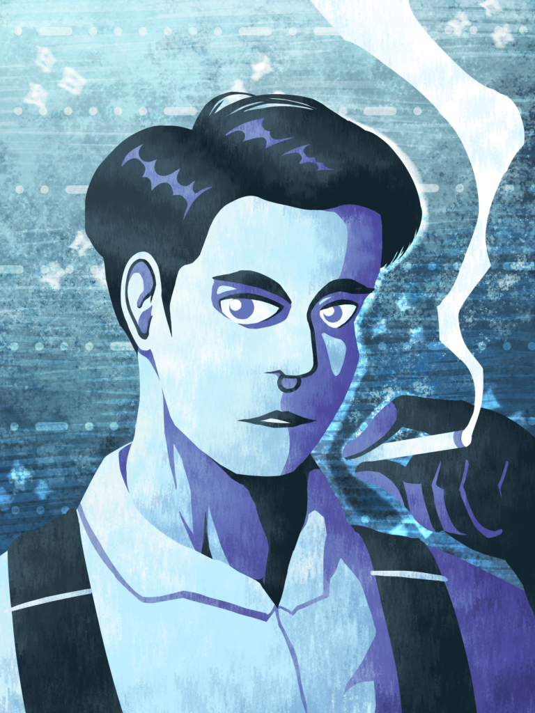
Blunt knew they wanted a typical ‘cleaner’ character. A badass, who cleans up crime scenes and makes (occult) evidence disappear. Winter aspect, of course, to ensure silence. The only pointers I got were: strong, serious, and well-dressed, but in a bland way. That immediately sounded incredibly boring to me. Yes, Winter is not an especially flashy aspect and yes, being inconspicuous is the point of the character, but there is a difference between doing an established trope and just being unimaginative. So I asked if we could make the character a woman.
Changing a character’s gender or gender presentation can add a lot of intrigue. We’ve all seen the stoic tough guy archetype that plays into stereotypical expectations of masculinity. It’s the obvious route to go for this kind of character in our contemporary cultural context. While making the character a butch woman instead isn’t exactly breaking new ground either, it is a step away from the norm and allows us to play with the tropes a little bit.
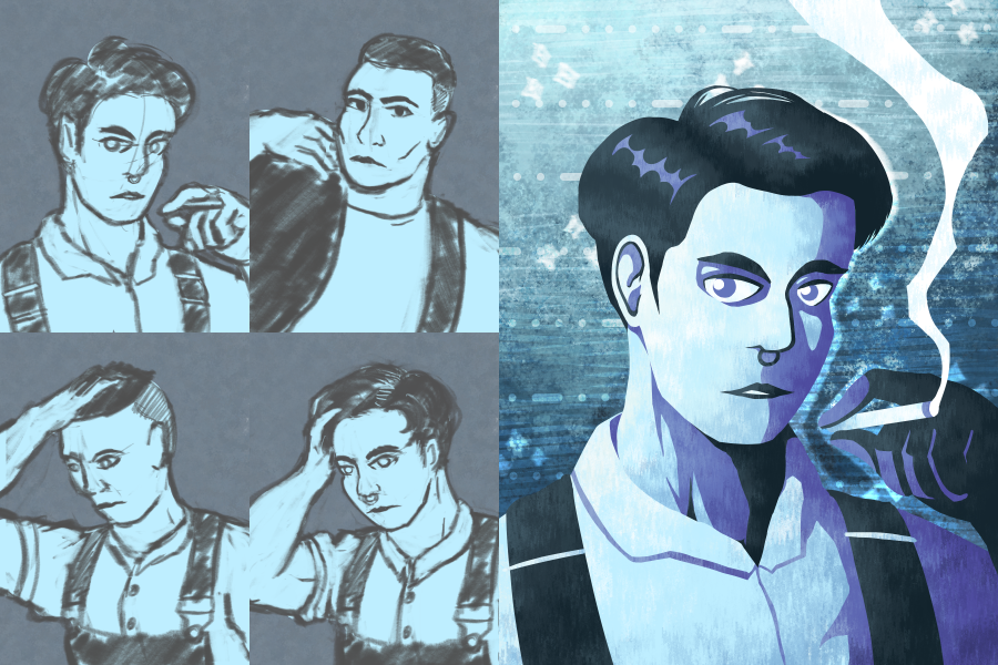
Moving along I began sketching. Suspenders and short hair were a good fit for her – long hair and flowy clothes would just get in the way while working. Plus, the suspenders and shirt combo still reads as clean and professional, which is a visual trait she shares with her boss, creating a link between the two characters. We opted for the first design with the resting pose. As much as we wanted to show off her bicep or a prop, they took up a bit too much visual real estate and it was more appropriate to communicate a calm mood to give the impression of quiet strength. Instead I hinted at her profession by giving her gloves and making the shadows really sharp and pointy to give her a slight air of danger. Viv isn’t unapproachable, but her presence was intended to be a bit imposing. Someone who you don’t want to question as to why they’re here and what exactly they’re doing. The piercing and cigarette meanwhile imply a more wild, nonconformist side. Perhaps there is more to her than just following her boss’ orders?
BLUNT: I also really liked that suspenders are a tiny bit out of fashion. There’s also the Morse code in the background. More than any of our other characters, Viv feels like she could blend into the interwar/postwar period of the OG Secret Histories, which makes her feel out of place here in a way that serves her story.
While designing Viv was mostly up to me, Blunt had much more specific ideas for Paloma, our ambitious salsa dancer. She is modeled after a friend of his and Cultist Simulator’s Dancer DLC served as a specific inspiration as well: invoking animal aspects to go beyond her body’s limits. She was also supposed to have a visible paw-tattoo. However, as a competitive salsa dancer she should still look refined and done-up. Thanks to a more clear direction, there was a lot less fussing around with the sketch. Blunt approved the initial idea and I started rendering the image while trying to think of ways I could blend classy adornments with signifiers of animalism and ferocity. This is where we ended up:
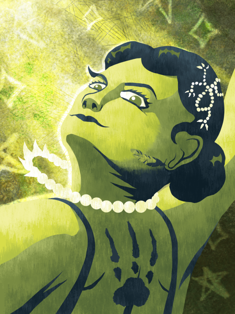
BLUNT: One of my favorite things about these portraits is the way we can include visual links to other characters. It’s not for nothing that Paloma’s tattoo has the same number of claws as the percussigant, or that Galavel holds one of the Emissary’s flowers.
I chose a pose mid-dance, depicting her in her element, exuding confidence and an expression that asks “Can you keep up with me?”. That way I could showcase both her attitude as well as the tattoo on her back, while adding movement to the picture. Her necklace, earring and the lock of her hair all point to the upper left of the image, following her motion, while framing her expression. They also all use elongated, pointy shapes that parallel the tattoo’s long claws, which are further repeated by the shadows on her neck and corners of her smile. Her hair ornament also vaguely resembles the shape of a stylized lizard crawling across her head. Both the neck and hair accessories (as well as the hair itself) incorporate rounded shapes to soften her appearance again and provide an air of refinement. This mix of sharp and rounded shapes blends her fierce nature with her high-society attire.
With the background lighting I implied a stage light and underlined it with some pentagrams and sparkles. Our backgrounds are flat and abstract, lending themselves to symbolism that can communicate ideas that are more complicated to express with character design alone. The symbolism isn’t always subtle, but there are definitely layers to it. The pentagrams, the spotlight, the tattoo are all obvious. But what’s happening with her necklace and earrings?
Spirits: Breaking Our Own Rules
Compared to our human cast, the spirit characters are significantly less straightforward to design. Like the player character, they are fundamentally inhuman beings, guided by the hidden principles that govern the occult world. I wanted to visualize that by making their portraits noticeably distinct from the humans’, which is why they don’t adhere to the limited palette of colours that they use. They, and they alone, break the rules of our established style and are visually marked as ‘alien’.
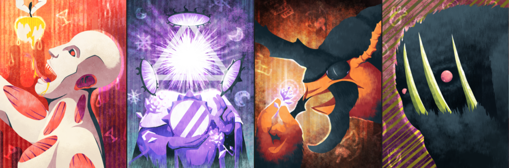
Because the spirits are decidedly inhuman, their character design process was a lot more involved. We decided to start with full character concepts instead of going straight for the sketch phase, because these decisions were likely to influence the writing in a way human design wouldn’t. To take an example, here were the notes I had after discussing the Emissary of the Moon:
- should have artificial face
- imperious, but maybe sad
- mirror-face
- biblically accurate angel vibes
- angelic, holy creature vibe
- made of shapes and stars?
- nebulous, but wearing clothes
- definitely inorganic
- abstract harbinger of heaven
- origami vibe
- Knock aspect
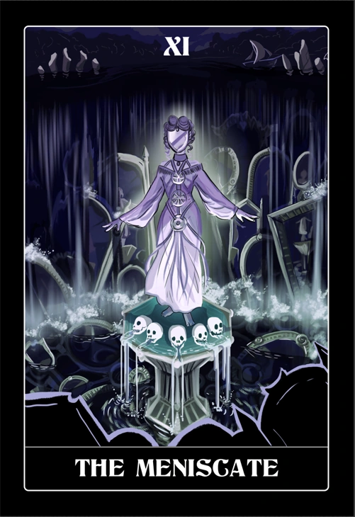
Since the Emissary was going to be closely connected to the Meniscate (one of the gods of the Secret Histories), she was the obvious starting point for visual inspiration. The pointers I took from her were: humanoid without a face, flowing water, mirrors, wheels, and flowing robes. I also tried to incorporate the themes of balance and the moon into the design. A natural fit for this character.
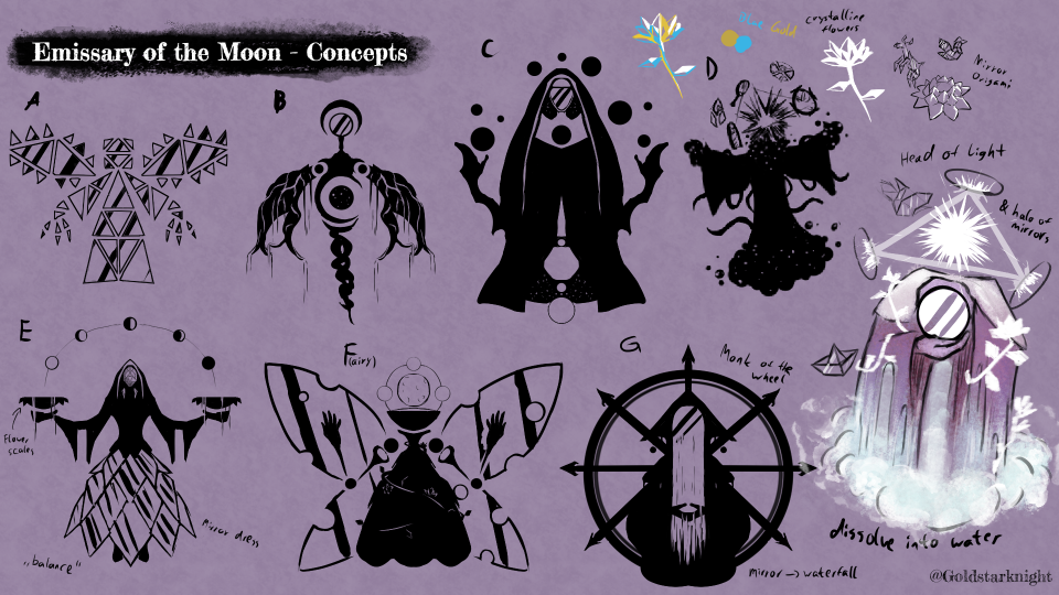
There are lots of ways to do concept art. For our purposes doing silhouettes was a great choice, because they allowed us to communicate shapes and some important details without getting lost in the weeds. Remember, at this stage we are still trying to form an idea of what the character even looks like. I don’t want Blunt to look at this and get hung up on one small thing like a pattern on the cloth. A concept art sheet is a collection of ideas that should allow us to hone in on what works and what doesn’t by means of visual communication. To illustrate what I mean take design A. It is, in my opinion, the most boring design among the ones shown here. The idea is pretty cool – an angel made entirely out of mirrors – but it’s way too one-note. It was never going to get picked and I knew that while I was drawing it. So why include it at all? Why not delete it off the sheet and do a new one?
Two reasons: first, it gets the ball rolling. By looking at it and asking myself ‘Why doesn’t this work?’ I can make sure that the other designs are better. Having it next to them, I have a constant point of reference of what I’d like to improve on.
Second, this communicates to Blunt that I explored this idea. It’s a gesture saying “Hey, I looked in that direction and this is what I got.” It shows them where my mind was at, from which they can glean if we were on the same page. Also, the design might give Blunt an idea for an element should make it into the final design. That wasn’t the case here, but it is possible to imagine a scenario where they liked the triangular mirror shapes and asked me to include them in the final version.
Our favourite designs were the coloured one (which was inspired by D) and G. We definitely wanted to use the crystalline flowers and flowing water, but were on the fence between which iconography to use: the eastern monk or the Christian saint? The monk was more unbothered and impervious, but the saint better communicated the ‘harbinger of heaven’ idea. I made some quick sketches and after some discussion we settled on the latter.
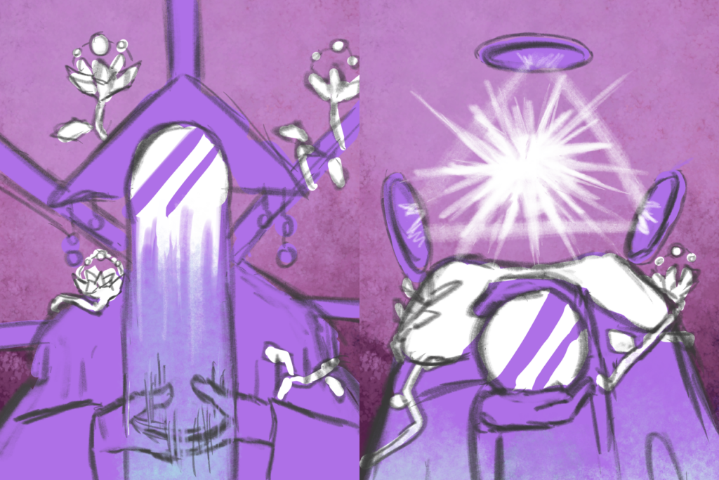
On Blunt’s request I also included the “gnostic gang sign” to really drive home the sacral imagery. My favourite element is the “head” – an eye of providence made of pure light, contained in mirrors.
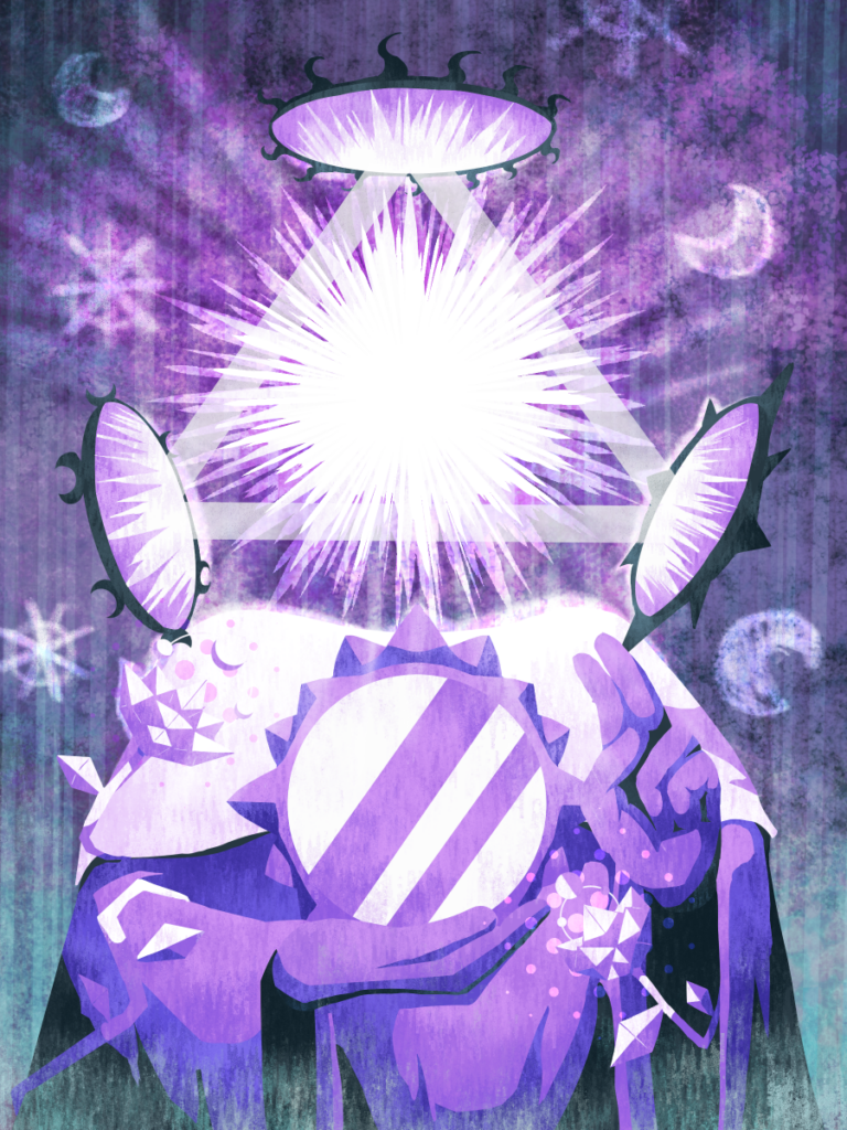
BLUNT: Said “gnostic gang sign”, a sign of the trinity, also suits the Meniscates three-aspected nature. It’s also worth noting that the mirrors on each corner of the eye have slightly different frames.
I could talk about character design for hours, but in the interest of time, I’ll stop myself here. It hopefully has become clear how much work and thought we put into our portraits and perhaps you also learned something about how to go about the process yourself. An art teacher of mine used to say: “The one who knows more, sees more. The one who sees more, knows more.” I hope I was able to help you see more.
Personally, working in tandem with Blunt to flesh out our colourful gallery has been a blast for me and I can’t wait to design the remaining characters. By the way: did you know that if we hit our Kickstarter stretch goals, we will add even more to the mix? The development has been quite the journey so far and we’d love to see the game become a reality, so please spare us a few dollars, if you enjoyed this article.
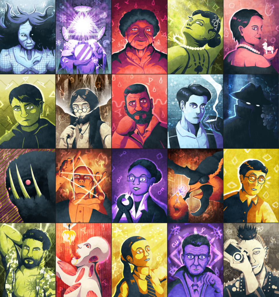
Alright, that’s enough solicitation. Here is a gallery of all the character art from the game so far. Take a good look. What’s their deal? Do you see more now?